minirig

Luton Point - Rebranding Luton Shopping centre as a local hub

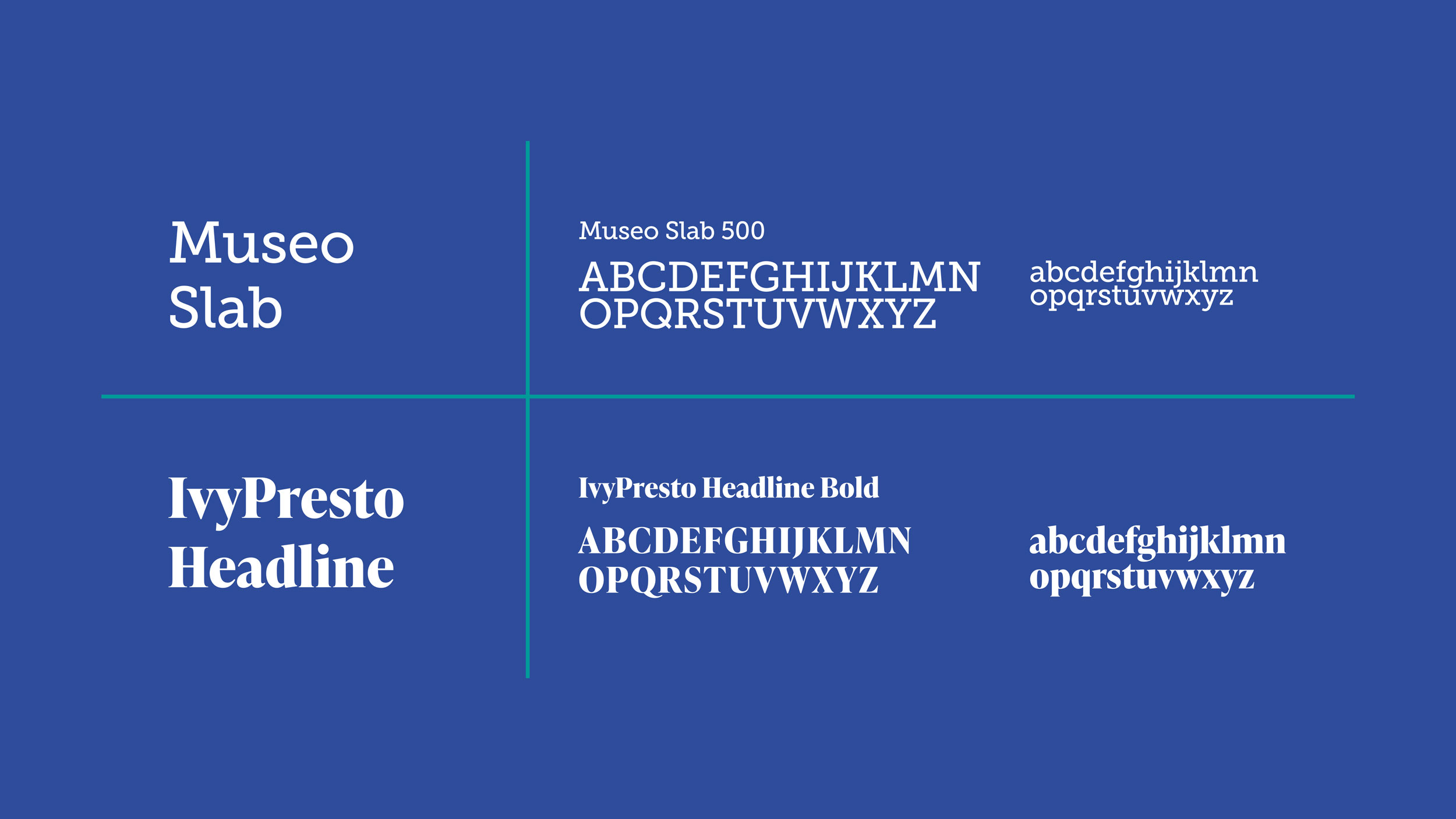
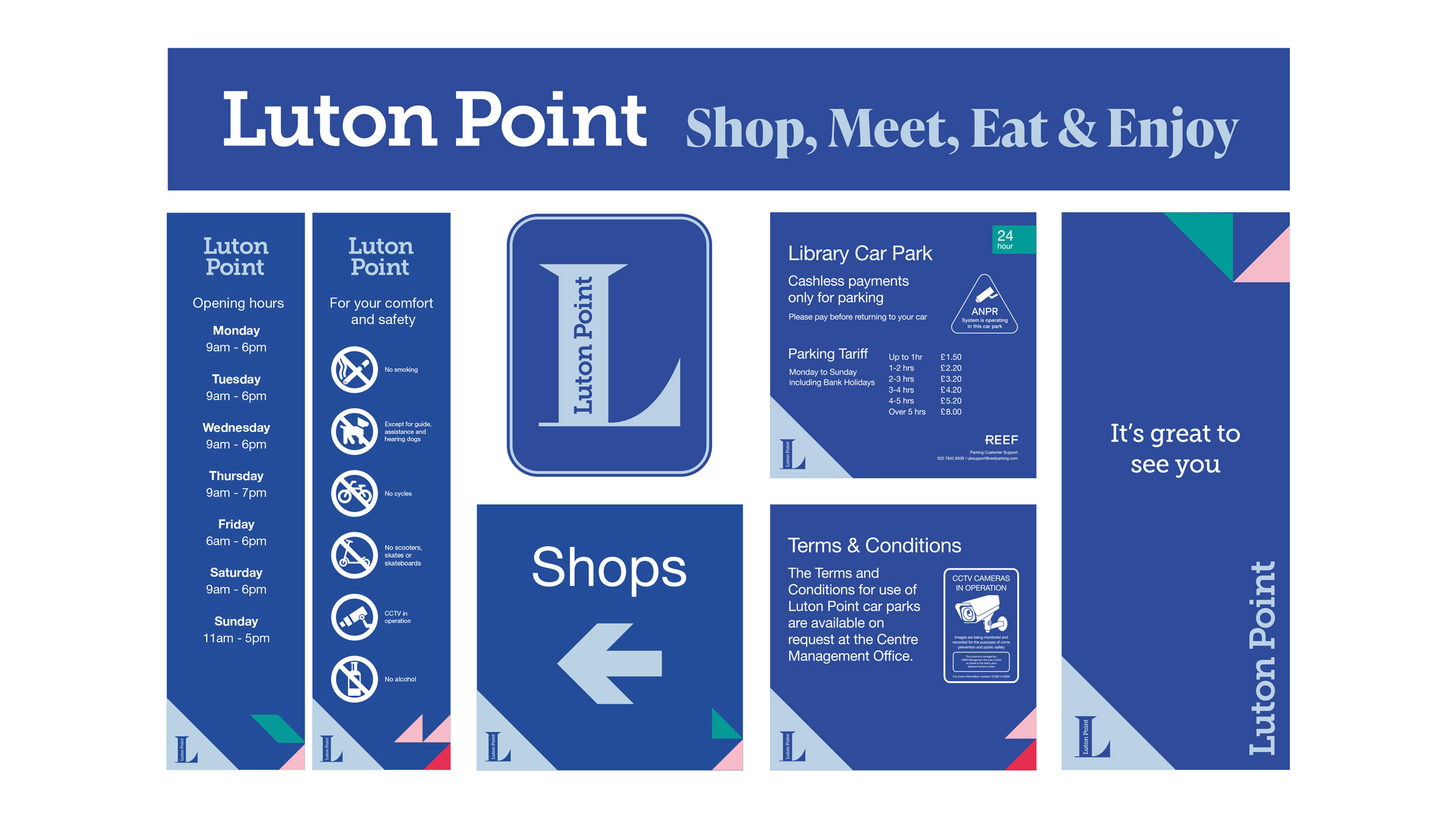
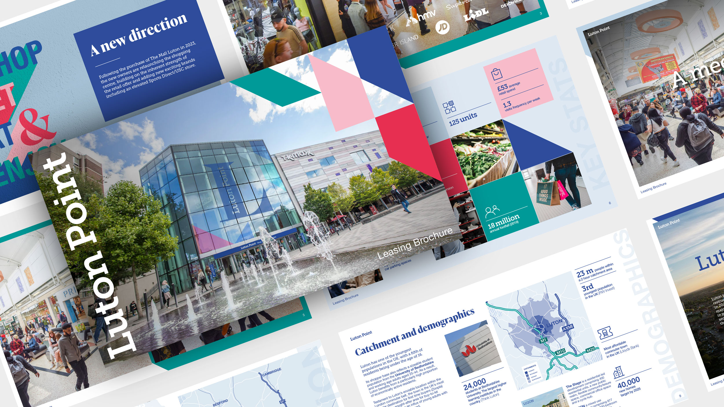
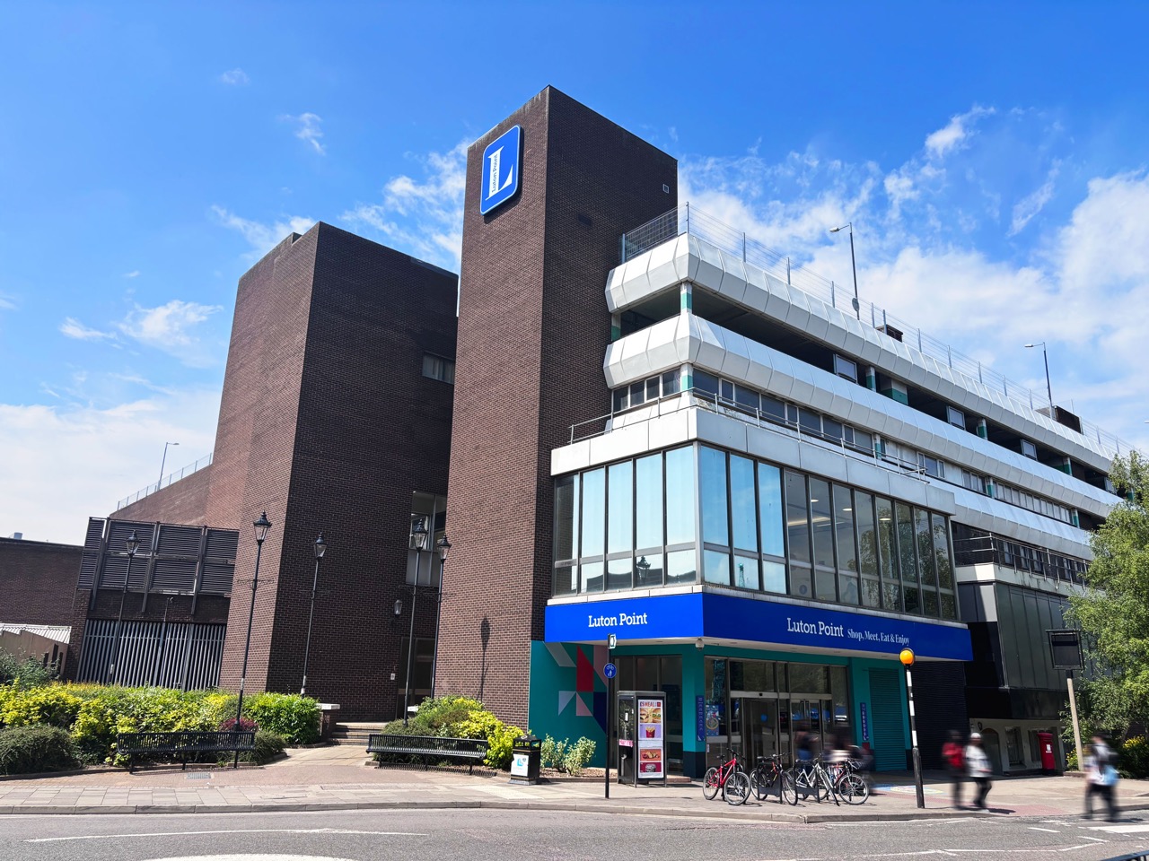
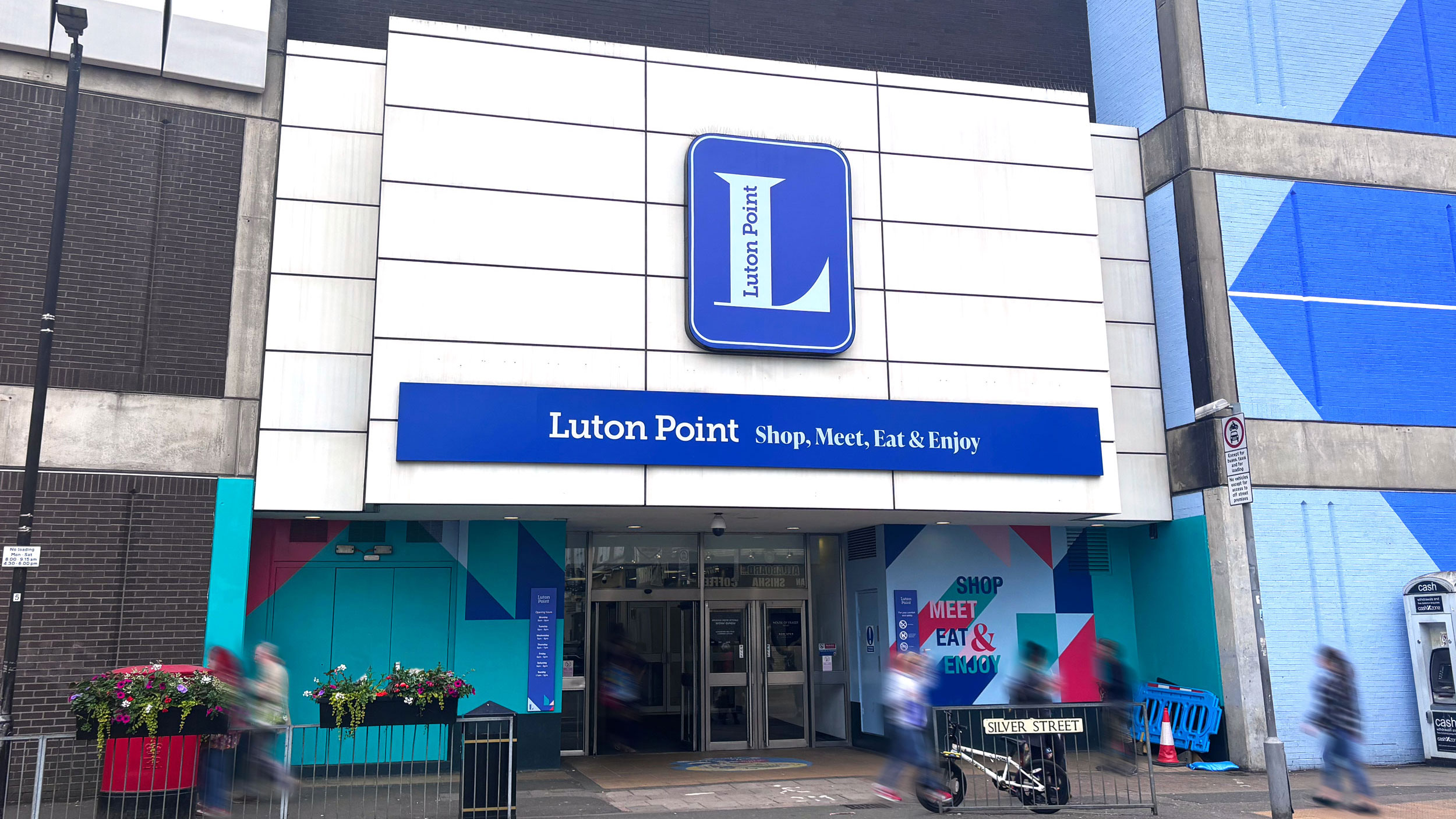
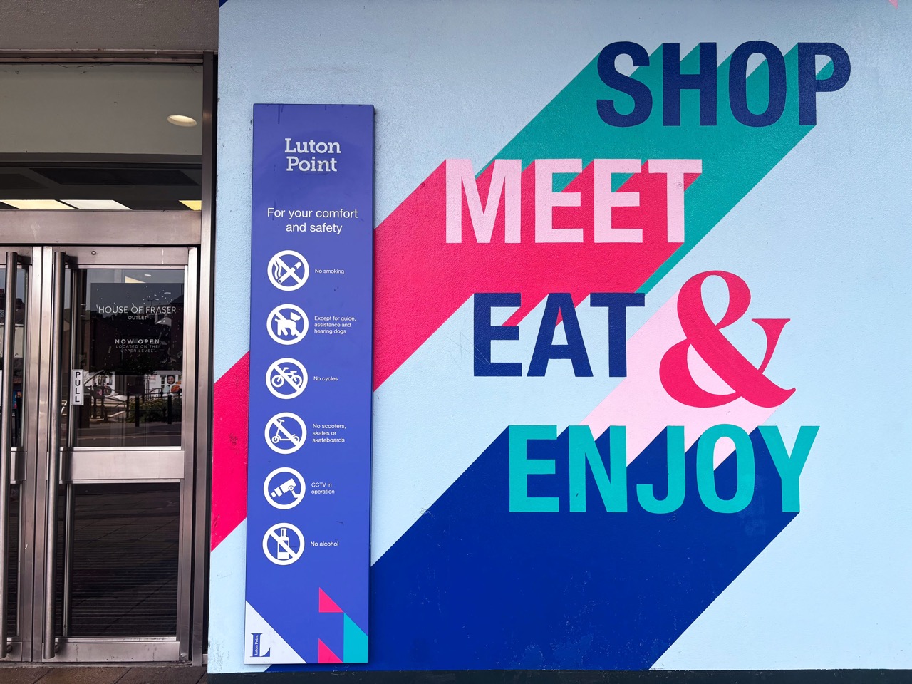
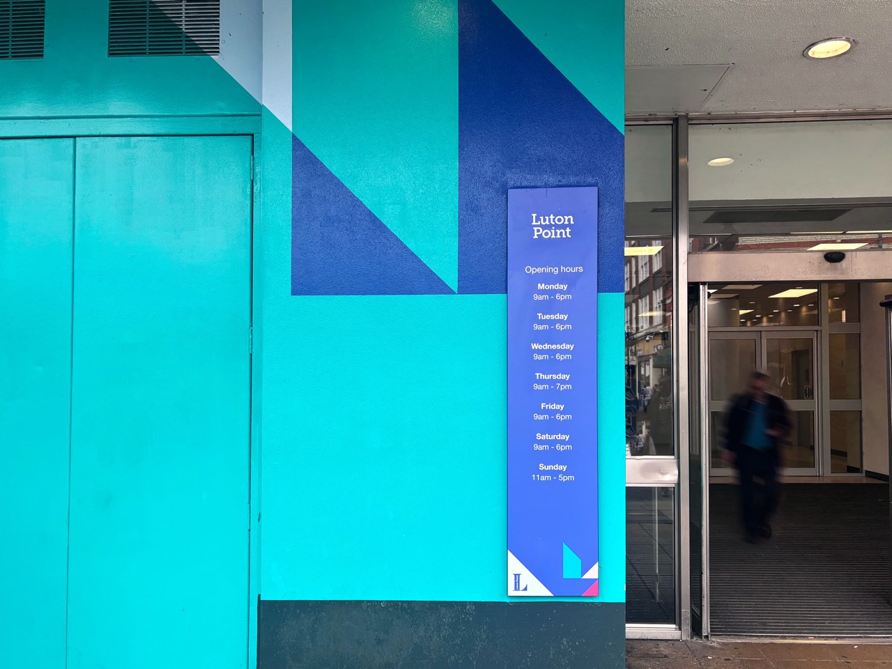
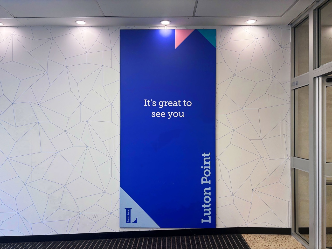
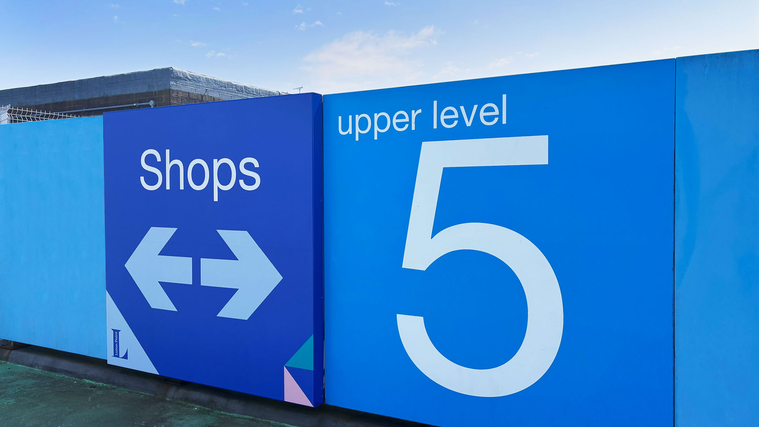
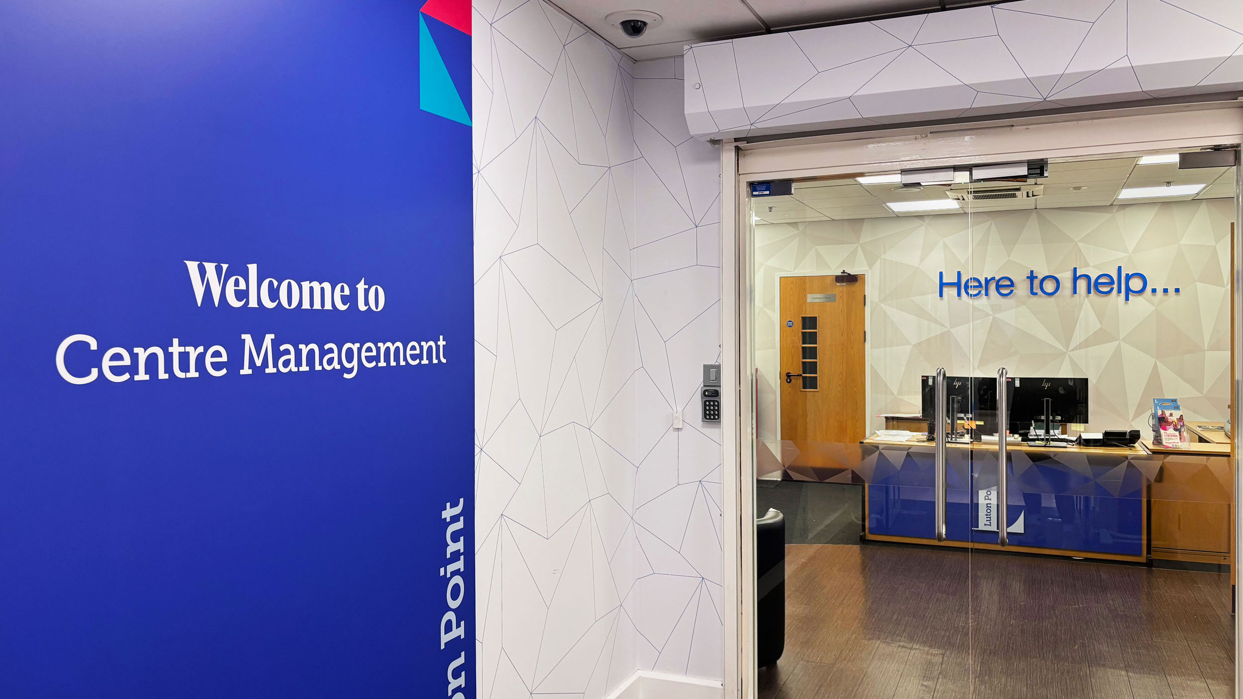
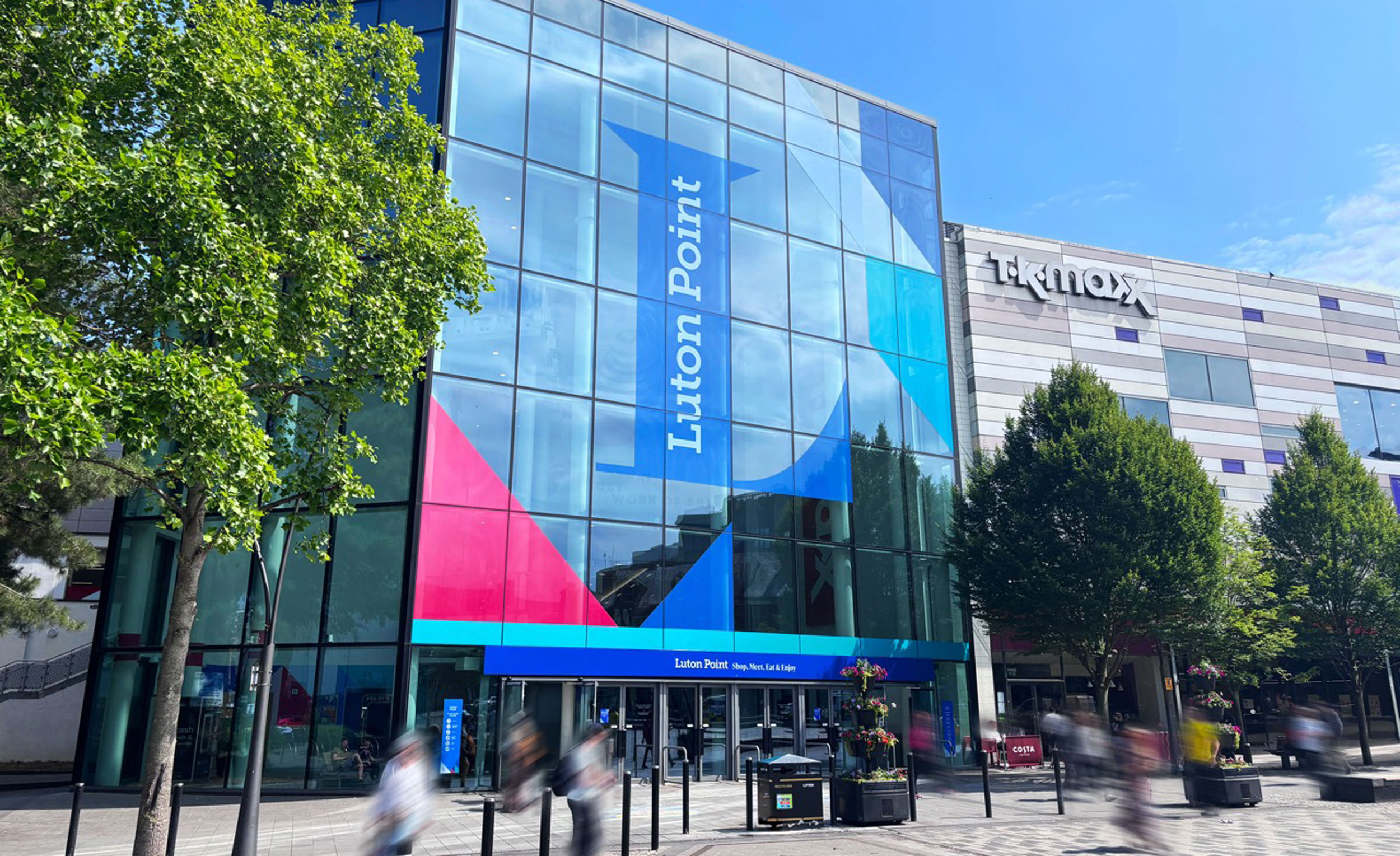
A full rebrand of a major community shopping centre in Luton, covering naming, brand strategy, identity, guidelines, and signage. The bold "L" logomark anchors the identity, while an angular geometric pattern system provides flexibility across marketing and communications. The new identity was rolled out across all entrance, wayfinding, and car park signage.

Client/Partner:

Frasers Group

Project Info:

Branding & identity, logo design, marketing material, environmental graphics, signage
Luton

Logo & Pattern Desgin

Newly created logo for Luton Point as well as the brand pattern and colour palette that form the brand system.
Luton

Brand Typography

The typefaces that make up the Luton Point brand. Easy to read Museo Slab for signage and information, whilst IvyPresto adds a humanistic character for marketing material.
minirig

Signage & Wayfinding

The signage and wayfinding system across the shopping centre to create a cohesive information hierarchy - including the logo, brand pattern and custom icons.
minirig

Marketing Brochure

Marketing brochure created to advertise spaces to new tenants. Displaying how the brand stretches beyond environmental graphics and signage.
minirig

Shopping Centre Entrance

One of the entrances to the shopping centre showing the array of graphics and branding to transform the space.
minirig

Shopping Centre Entrance

One of the entrances to the shopping centre showing the array of graphics and branding to transform the space.
minirig

Wall Graphics & Signage

The layered system of informational signage on top of painted environmental graphics.
minirig

Wall Graphics & Signage

The layered system of informational signage on top of painted environmental graphics.
minirig

Internal Signage

Tall totem wayfinding on entrance into the centre.
minirig

Car Park Signage

Large wayfinding across the multi-floor car park.
minirig

Get In Touch

ruairimdesigns@gmail.com

EMAIL

+44 739 229 6073

PHONE

linkedin vimeo